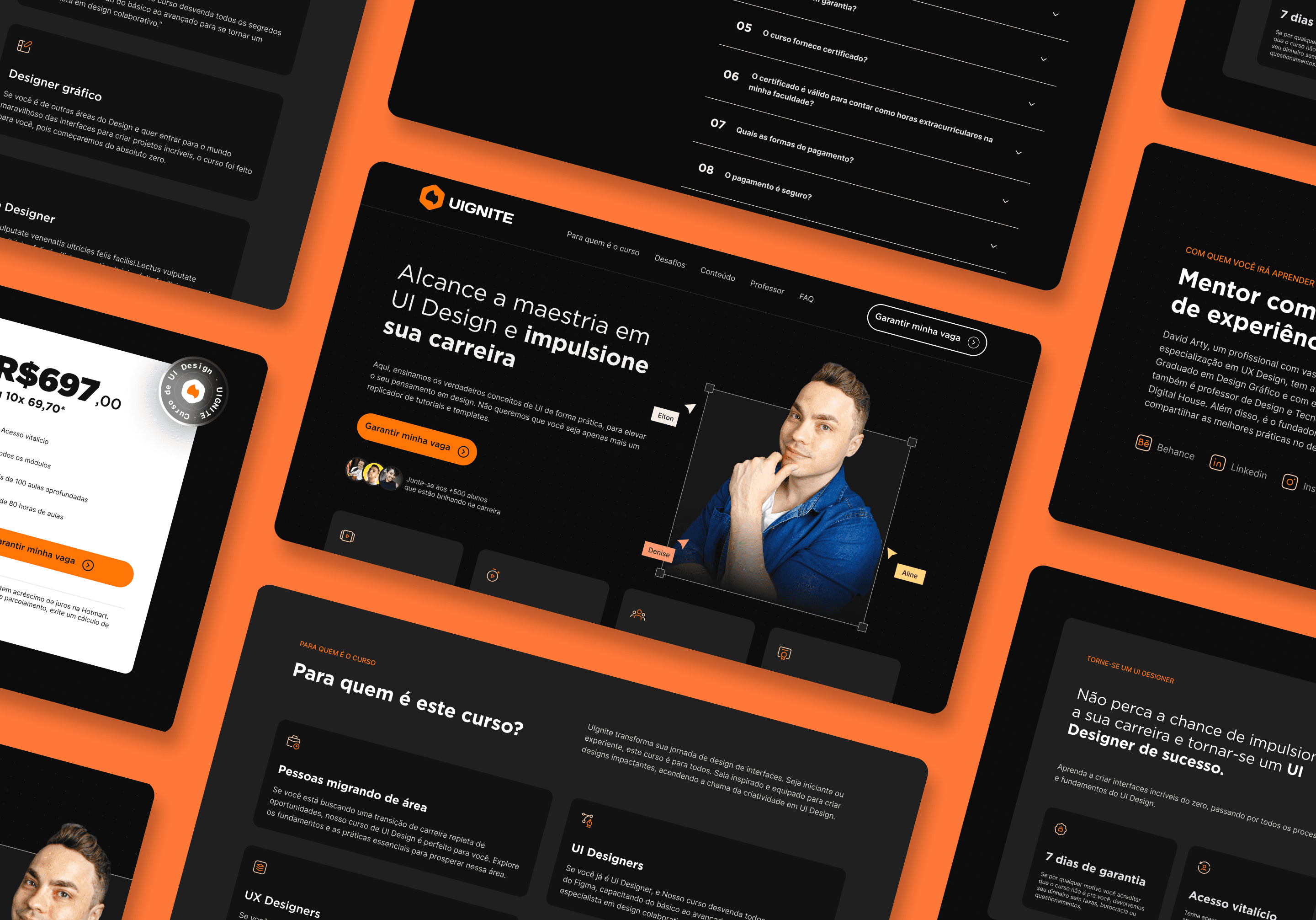
Our goal with this landing page was to create an engaging and informative experience for design enthusiasts. The project was meticulously crafted to convey not only the course details but also the passion and expertise behind interface design.
Company Overview
Chief of Design is an instructional design channel that makes learning design simple, practical, and inspiring. Covering Graphic Design, Visual Identity, UX/UI, Web Design, and other design and technology topics, the channel is led by David Arty, a visual interaction designer and UX specialist with over a decade of experience as a designer, educator, consultant, and speaker.
Main Challenge
The main challenge was to create a platform that not only informed but also inspired. The landing page was meticulously crafted to capture the essence of the course: the fusion between theory and practice, between the science of design and the art of engaging the user.
Design Goal
Every aspect and detail was strategically designed - from the careful choice of color palettes to the thoughtful arrangement of visual elements - with the aim of conveying the principles of user-centered design. User experience was given top priority; every interaction, every point of contact, was meticulously planned to guide visitors seamlessly, gradually revealing the depth and value inherent in the offered course.
UI Design Responsibilities
Created comprehensive wireframes
Designed high-fidelity mockups with pixel-perfect precision
Built interactive prototypes for user testing
Established a scalable design system
Collaboration & Impact
Designed wireframes and high-fidelity prototypes to quickly validate ideas.
Structured visual hierarchy and user flows to ensure usability.
Facilitated design critiques
Created design documentation and implementation guidelines
Visual Research
Analyzed competitor interfaces, design trends, and user behavior patterns
Wireframing
Analyzed competitor interfaces, design trends, and user behavior patterns
Component Creation
Built a comprehensive design system with reusable UI components
Prototyping
Created interactive prototypes to validate design decisions
Validation
Conducted usability testing and iterated based on feedback
Visual Hierarchy
Implemented clear typography scales, a consistent spacing system, and the strategic use of color to guide users through interactions.
Interaction Design
Redesigned the landing page to simplify navigation, highlight key actions, and create an intuitive, conversion-focused user experience.
UI Elements
Primary
#FF7506
#FF7839
#FF9973
#FFBFAC
#FFEAE6
Secundary
#FFAD46
#FFC25E
#FFD580
#FFE7AC
#FFF8E6
Neutral Colors
Typography
Regular
Medium
Bold
Black
Logo redesign
Before
After


Figma
Miro